For example, you may wish to reproduce your marketing print onto roller banners, framed wall graphics, light boxes, vehicle graphics, building drapes, flags, signage and pop-up displays to name but a few.
This is what is known as large format printing and so requires print ready, large format artwork. This print ready artwork exist as digital files namely PDF, EPS and TIFF and can be adopted by the printer to produce the final print. These file extensions minimize errors and ensure that your artwork can be processed as quickly, efficiently and accurately as possible.
Here is an outline checklist to help you maximize the very best print for your artwork.
- Provide a snap-shot of your artwork as a low resolution jpeg image because this will give an early indication of the scope of the project and a fantastic visual reference guide.
- Colour matching is the most important criteria in any print reproduction. Your brand values, identity and presentation are the most recognizable elements of your business. If you have specific colour references such as swatches these provide great visual aids. Try to avoid verbal description or pantone colour references as these can be misinterpreted.
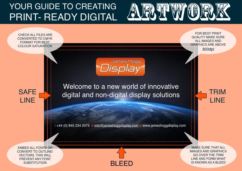
- Have you heard of CMYK? This four letter acronym stands for Cyan, Magenta, Yellow and Key (black) and forms the standard colour model in printing. By converting any pantone or RGB colour refernces to CMYK files you will get the best and most accurate reproduction of colour.
- On the subject of text and its inclusion in your artwork you must convert all text to outline/vectors or embed the fonts. Vectors are like geometrical navigation points and shapes and help identify and determine the direction of colour, fill, shape and line thickness between these points. Without this important conversion, text and images can be removed by certain software platforms and operating systems and replaced with low resolution images and different fonts disrupting final artwork proofing.
- Dots per inch or dpi. This is a measure of dot density for the amount of dots per linear inch. The higher the ratio the better the print. If your image looks out of focus or ‘pixelated’ the dpi may be to low for good quality print. When creating your artwork ensure all the images and graphics are a minimum 300dpi (for small format) and (150dpi)large format) A lower dpi used on large format printing is a little more forgiving because the viewing distances tends to be a lot greater when compared to something like a brochure or fine print. For the best results use vector based graphics as described above.
- Don’t stop the bleeding! No drama here its a term used in the print trade that simply describes the run-out or over fill of colour and images so they can be trimmed back to the finished size of the artwork preventing unsightly gaps between image and the edge of the artwork.
- Present your artwork in a portable document format (PDF). This format is one of the best file configurations and is not effected or influenced by any software, hardware of operating systems. In certain instances, such as short deadlines, a pdf file can go straight to print without going through the proof stage. This should only be implemented by an experienced artwork developer and with the understanding of the printer.
- Sending your artwork. You can send it via the post as a CD, SD Card or memory stick if time allows. To save time you can email small files directly or, for large files, use a file transfer service like www.wetransfer.com or www.dropbox.com also a popular choice for the safe delivery of artwork over the internet.

This guide is simply that. A guide. Optimizing your artwork to the best output will depend on the end use. The above guide is targeted at large format printing. For more advice and help contact James Hogg Display on 0330 333 6106 or info@jameshoggdisplay.com
